Thinking about refreshing your home this winter? Great idea! With Rhode Island’s chilly weather keeping us indoors, it’s the perfect season to tackle those interior painting projects.
So, why not give your living spaces a fresh, stylish update?
Let’s start by exploring this winter’s top interior painting trends, breaking down the colors, styles, and techniques that are capturing the spotlight.
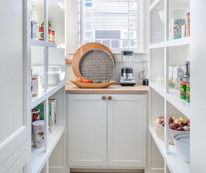
Warm and Cozy Neutrals
Cool, grey tones have been a go-to for many years, and have served their time well. But if you haven't noticed, we’re now seeing warm, neutral shades take over the “can't-go-wrong-with-that” category. Creamy whites, taupes, and soft beiges are becoming popular choices for home and business owners alike.
These hues not only create a cozy atmosphere but also pair beautifully with winter’s natural light.
Why choose warm neutrals?
They work seamlessly with any decor style.
Perfect for Rhode Island homes that want to feel inviting (especially during long, cold winters).
Tip: Use warm neutrals as a base, then layer in textures like knitted throws or bolder cushions to enhance the cozyness. Paint color doesn't always have to dominate; sometimes it does its job best when paired with other complementary decor.
Bold Accent Walls
On the other end of the trending spectrum we have accent walls. Accent walls continue to be the main way to integrate “that one color.” You know, that color you love but couldn't use to paint a whole room without it being just too much?
This is an awesome way to enjoy a splash of any color while not overwhelming the space (or your life).
- Adding Visual Interest: Breaks up the monotony of a single color scheme and creates a striking focal point.
- Defining Spaces: Perfect for open-concept layouts, an accent wall can subtly define areas like a dining or living area.
- Enhancing Room Depth: Darker or bold colors on an accent wall can make a space feel more dynamic and layered.
Nature-Inspired Palettes
This winter, earthy tones are also getting a lot of attention, bringing the peaceful outdoors indoors. Think mossy greens, rich browns, and terracotta. These colors not only evoke a sense of calm but also connect your home to the natural world. Not a bad deal given the technological age we live in!
Where to use them:
Bathrooms: Earthy greens and soft terracotta tones can create a calming, rejuvenating space that feels like a natural oasis.
Living rooms: Warm, earthy tones also create an inviting atmosphere, which is perfect for entertaining or relaxing by the fire.
Bedrooms: Soft greens and earthy hues promote relaxation, making them ideal for creating that tranquil sleeping environment.
Dining rooms: Terracotta and rust tones add warmth and character, and can make meals feel more intimate and enjoyable. And who knows, they may even stimulate some good conversations!
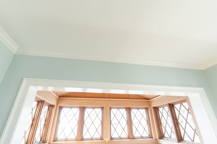
Creative Ceilings: A Way to Keep Your Head Up
Ceilings are no longer being left out of the design conversation. This winter, painting ceilings in unexpected colors or patterns is a popular and, well, unexpected trend. A soft blue ceiling in a bedroom or a dramatic charcoal ceiling in a dining room is a sure way to transform the entire space.
Why paint the ceiling?
For one thing, it can add height and dimension to a room if you get the color scheme right.
It also creates an unexpected design element that feels custom. Everybody can appreciate an “outside-of-the-box” style, and a unique ceiling does just that.
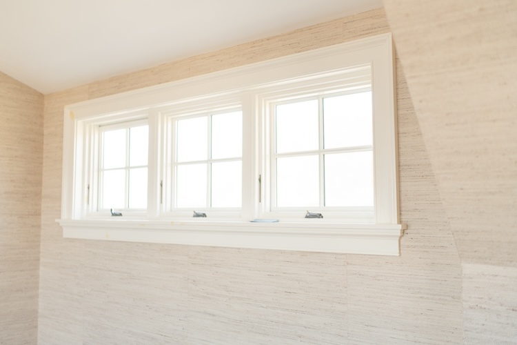
High-Contrast Trim and Molding
For Rhode Island’s older homes with historic charm, high-contrast trim is a fantastic way to highlight architectural details. Think black trim against white walls or deep navy paired with light grays.
What makes it work?
Creates a polished, tailored appearance: The sharp contrast between light and dark creates a visually striking, clean look that elevates any space.
Accentuates crown molding, baseboards, and window casings: By emphasizing these elements, high-contrast trim highlights the craftsmanship and character of a home’s architecture.
Adds depth and dimension: The contrast draws the eye, making the room appear more dynamic and giving a sense of structure and balance.
Blends classic and modern styles: While high-contrast trim nods to traditional design, its boldness also feels fresh and contemporary.
Minimizes visual clutter: Dark trim around windows and doors naturally frames views and makes transitions feel intentional and organized.

What's Your Takeaway?
This winter, you have endless opportunities to revitalize your interior with fun and exciting painting trends. From cozy neutrals to bold accent walls and everything in between, there’s something to suit any style and space.
Ready to make it happen? Dennis Moffitt Painting can Help! We’ve been helping Rhode Island homeowners bring their vision to life with expert painting and carpentry for over 25 years. If you have questions about your next painting project or would like to set up a consultation contact us today.
Frequently Asked Questions
Q: Why is winter a good time for interior painting?
A: Winter’s low humidity helps paint dry faster and ensures a smooth finish. Plus, interior projects make sense when outdoor work is limited.
Q: What’s the best way to choose a trend for my home?
A: Consider your home’s overall style, existing furniture, and your personal preferences. A professional painter can also provide color consultations tailored to your space.
Q: Are bold colors too risky for small spaces?
A: Not at all! Bold colors can make small spaces feel dynamic. Use them on a single accent wall or as part of a monochromatic scheme to maintain balance.
Q: Can I combine trends, like high-contrast trim and jewel tones?
A: Absolutely. Many trends pair well together. The key is to maintain a cohesive palette and balance bold elements with neutral ones.